BLOGGER TEMPLATES AND TWITTER BACKGROUNDS »

Thursday, 17 March 2011

EVALUATION-Question 4


View more presentations from jameswilko1

Wednesday, 16 March 2011

EVALUATION Question 3

What have you learned from your audience feedback?

During our project we decided to get together a focus group, The watched our finished music video. At the beginning we gave them all a pencil and piece of paper so they could write down the things that we should improve on if we were to remake this music video and the things that they thought worked really well. Each piece of paper was anonymous so we didn't know who wrote what comment. From this i learnt that Our editing was well put together , the structure of our music video was a liner plot However as well as the positives some people agreed that the kissing was a little off putting and the keyboard player was out of time and so these are the things we should work on if we ever improved ourselves.

Here are some pictures from the focus group:

We also made a questionnaire and got people to fill them out to see what they thought of our music video. We had many positive responses as well as balanced improvement comments. From this i learnt that me and my group could have perhaps been a lot more creative with our ideas.


From the digi pack and advert feedback i learnt also that our advertisement were good representations of the actual bands name itself and we were told that it was a good idea because its states FUN and COLORFUL personalties. Which in my opinion i think is great for a band. We used similar pictures for both some people agreed that this was a good way to recognize the band visually however some people thought that we should have perhaps used more of a mixture of pictures to make both advertisements stand out more.


Tuesday, 15 March 2011

EVALUATION- Question 2
How effective is the combination of your main product and ancillary texts?


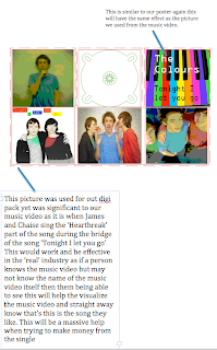
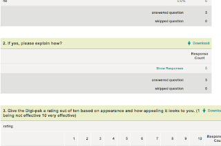
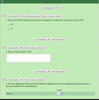
^ This a copy of a little bit of out survey we created based on our advertisement for The colours.


^ What i am saying in this copy of our digi pack is that the pictures i have commented on are effective as they are even taken from the music video or poster itself so these will have been seen before somewhere and so if someone would forget the name of the song or the band then straight away visually they will make a connection with the band and the music video/single.


^ here are ratings of how many people by a % have taken the survey and what they think of our digi pack and poster , how effective it is and how we could have made improvements.


EVALUATION-Question 1

In what ways does your media product use , develop or challenge forms and conventions of real media products?

We tried a mixture of actual words that make us fimillar with the media promotion and filming society. We said things such as "321 Lights Camera , Action!" when filming mainly for fun. We also used different media technology's and came up with a number of ideas which someone would use in the real industry. Not only did we do this but also we came up with ideas from real music videos and based some of our scenes around them.

Examples of comparisons we used taken from real music videos:

originally we wanted to create something like the first picture and rather than showing arguments we wanted to show the thoughts of the lead singer. When it came to editing we decided as a group it would be easier to stick to the idea of text coming up on screen to let the audience know what is going on yet change it by making it simple and showing an argument in another way than just using dialogue.

We used a lot of lip synching in our video to make our video believable to the audience. This is a media convention as ALL music videos use this .


Also we mentioned well known media companys and labels to make out project have a bigger believable effect. We mentioned well known names such as :

and


Monday, 14 March 2011

Digi pack


FINALLY THE DIGI PACK :)


Wednesday, 9 March 2011

Curently

We had problems uploading the digi pack and so we are working on this at the moment and also i am starting on my evaluation in the drafts hoping to soon post it on her once i put the digi pack on first.

Friday, 4 March 2011

Poster! :)

Here is our advert , we decided to make a bight and colourful poster to emphasise the name THE COLOURS and to give a funky and bright impression. We took a picture of a keyboard in music and then we uploaded the picture to photoshop and decided to make the keyboard colourful to highlight the bands name.